Graph Maker (line/bar/pie)
Graph Maker (line/bar/pie) Summary
Graph Maker (line/bar/pie) is a ad-supported Android app in Productivity by garakutatoys. Released in Apr 2020 (6 years ago). It has about 29.1K+ installs and 72 ratings with a 2.25★ (poor) average. Based on AppGoblin estimates, it reaches roughly 584 monthly active users and generates around $<10K monthly revenue (0% IAP / 100% ads). Store metadata: updated Aug 27, 2023.
Recent activity: 22 installs this week (129 over 4 weeks) showing steady growth View trends →
Store info: Last updated on Google Play on Aug 27, 2023 .
2.25★
Ratings: 72
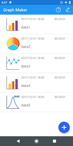
Screenshots

App Description
This app can analyse simple data and create pie / line / bar chart easily.
It is an application for simple data analysis that can handle pie / line / bar graphs.
You can automatically create a graph from binary data (category and number, number and number, category and category).
〇 Type of data that can be input
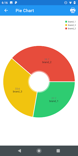
1. Category and quantity
Used to analyze "category and quantity" such as the type and quantity of items sold.
You can create pie charts and scatter charts.
The pie chart shows the percentage of input data.
The scatter plot shows the distribution and correlation of the data.
2. Quantity and quantity
Used when analyzing "quantity and quantity" such as height and weight.
You can create line and scatter plots.
Line chart displays a line chart.
The scatter plot shows the distribution of data, the regression line, and the simple correlation coefficient.
3. Categories and categories
It is used to analyze the relationship between categories, like the genres of your favorite books and TV shows.
This dataset can display a bar chart accruing input data and a crosstabulation.
You can also check the relevance by using Cramer's linkage number (independent coefficient).
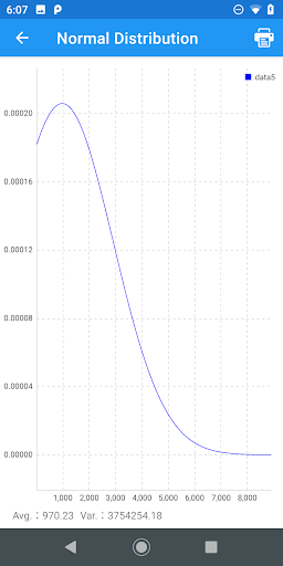
4. Quantity
It is used to analyze the grades of a test in a class or a single quantity, such as the number of app downloads.
Histogram (frequency distribution table) and normal distribution can be displayed.
The frequency distribution table can be used to check the status with real numbers.
The normal distribution is used to fit the input data to the normal distribution and estimate the overall situation.
* Saving / reading data
It supports saving / reading in CSV format.
〇 Output of graph
Supports output in PDF format.